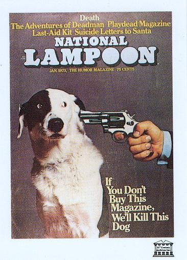
When does a magazine cover actually become an ad?
Toronto Creative Director and the inspiring author behind the AdTeachings blog Suzanne Pope made a perfect observation:
A magazine’s cover is rightly conceived as the ad that will entice you to pick up the magazine and buy it. Nowhere has that aim been more bluntly expressed than in this classic 1973 cover for National Lampoon.She is 100% spot on.
Think about every cover you have even seen or might need to design. The cover invites the reader to potentially stop and buy.
This cover caught my eye way back in 1973 as I made my way to the street car platform at the St Clair subway station in Toronto on my way to Northern Secondary High School. It spoke to me. It spoke to my sense of humor. It simply screamed "buy me or else".
After spending many a weekend listening to the National Lampoon Radio Hour from Buffalo, I was hooked and the magazine soon joined my families subscription list. Imagine what the mailman thought when they delivered National Geographic, Time, Newsweek, US News and World Report, MAD Magazine and National Lampoon to our house.
A couple years back a student of mine paid homage to this cover for our Creative Advertising Program at Seneca College when he helped create a series of posters stating "if you don't hire a Seneca Ad grad..." he also created a complete series referring to competing colleges with advertising programs... to bad we could never use them publicly (LOL):


No comments:
Post a Comment